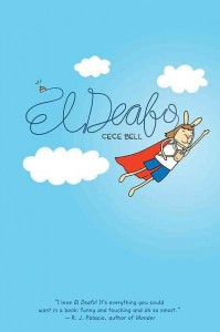
El Deafo
 As Jonathan tallies up your Online Mock votes, I’d love to give some more discussion to EL DEAFO, since it didn’t make our shortlist this year but deserves more exploration. Many of you are stumping for it, Anderson’s Bookshop has it on their Mock Newbery list, and For Those About to Mock hopes it gets a fair shot. But many people just have a hard time figuring out how to discuss it, and if the Newbery committee can’t either, then it’s not going anywhere. For instance, I said : “I do not believe that these criteria tell us that the text must carry the entirety of the plot, characters, setting and style. Only that we must find those elements distinguished within the text…at least whichever elements are pertinent to the text” and then I rendered the text from a scene in my blog post as straight text to show where I thought it was distinguished. But For Those About to Mock got a little stuck here:
“...In many panels, the text is inseparable from the illustrations. That is, the text itself has visual qualities, and when you render it as plain text, you take away a large chunk of the meaning. Consider the page on the right, where Cece sneakily turns off her hearing aids to drown out her new friend’s bedtime chatter. Bell represents the muffling of the friend’s voice by depicting it in fainter ink – a technique which she uses (with great effectiveness) throughout the book. In a panel like that, the text is a visual object, and I don’t think we can consider it as text anymore.”
I’m going to take exception with that last point. Why can’t we consider that text having both textual and graphic elements? Since Bell achieves the effect noted through a graphic application, that particular maneuver might not be an argument for distinguished text. But I don’t think we need to expect that the text has to stand alone, rendered as plain text. If it only means what it means graphically, fine. The graphic achievement is not the one being measured, that is all.
So: don’t consider the text separate from the illustrations. But when you put EL DEAFO next to … say…. THE CROSSOVER, THE KEY THAT SWALLOWED JOEY PIGZA, RAIN REIGN… does Bell achieve character, plot, appeal, theme, better than those, through what the text does in is textual way (not what the text does graphically?). I think that Bell’s words themselves, however they are rendered, build more effective characterization, and offer a wonderfully deep but humorous “interpretation of theme or concept” somehow much more subtly than any of those three. (Except maybe JOEY. I hold these two par on those counts. EL DEAFO has a more cohesive arc/plot that JOEY, perhaps.)
RELATED
The job outlook in 2030: Librarians will be in demand
The job outlook in 2030: Librarians will be in demand
ALREADY A SUBSCRIBER? LOG IN
We are currently offering this content for free. Sign up now to activate your personal profile, where you can save articles for future viewing


Add Comment :-
Be the first reader to comment.
Comment Policy:
Comment should not be empty !!!