Census visualization and a data set round-up
 Earlier this week, Gary Price shared news from the Census Bureau relating to its efforts to increase the use of visualization in making data available to the public.
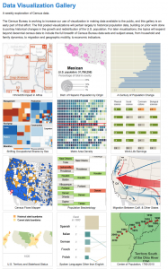
 Part of the effort is this beautiful gallery. The Bureau shares its plan:
The first posted visualizations will pertain largely to historical population data, building on prior work done to portray historical changes in the growth and redistribution of the U.S. population. For later visualizations, the topics will expand beyond decennial census data to include the full breadth of Census Bureau data sets and subject areas, from household and family dynamics, to migration and geographic mobility, to economic indicators.
These data visualizations, some interactive, have serious curricular relevance and deserve to be shared with science, math and social studies teachers.
Gary also pointed me to a recently released Which is Greater? Population Bracketology game (for March, I suspect) that would be fun for junior and high school classes.

As I explored these data visualizations, I considered connections.
The Common Core Standards call for learners to be able to represent and interpret data, to integrate and evaluate multiple sources of information presented in diverse formats and media (e.g., quantitative data, video, multimedia) in order to address a question or solve a problem, and to support their arguments based on data and evidence.
We also ask students to use new, authentic communication strategies. Infographics are an increasingly popular option. They require data digging and data analysis.
I started this post thinking I’d pull together one of those bloggy round-ups, but the post really wanted to be a curation instead.
Hope this Blendspace is useful. Feel free to embed.
![]()
RELATED
The job outlook in 2030: Librarians will be in demand
The job outlook in 2030: Librarians will be in demand
ALREADY A SUBSCRIBER? LOG IN
We are currently offering this content for free. Sign up now to activate your personal profile, where you can save articles for future viewing


Add Comment :-
Be the first reader to comment.
Comment Policy:
Comment should not be empty !!!