


2018 School Spending Survey Report
Britannica’s Encyclopedia Infographica Is a Boon for Visual Learners
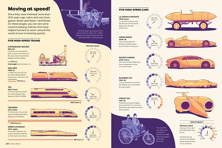
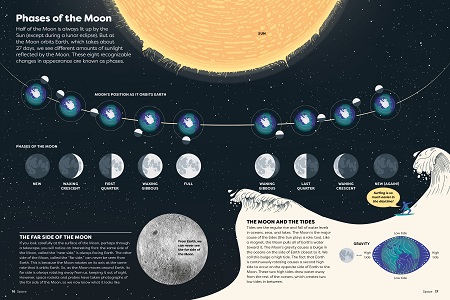
Learners of all ages can grasp facts at a glance in Britannica’s new Encyclopedia Infographica. Readers can explore thousands of facts about space, earth, animals, humans, and technology through two hundred original infographic illustrations, including maps, charts, timelines, and more.
 Learners of all ages can grasp facts at a glance in Britannica’s new Encyclopedia Infographica. Readers can explore thousands of facts about space, earth, animals, humans, and technology through two hundred original infographic illustrations, including maps, charts, timelines, and more. This groundbreaking tome is the work of writer and Britannica Magazine editor Andrew Pettie, Bloomberg News UK digital editor Conrad Quilty-Harper, internationally renowned data designer Valentina D’Efilippo, and the Britannica Group.
Why did you choose to make an infographic encyclopedia?
We wanted to make a new kind of encyclopedia that could be read and enjoyed by everyone, regardless of their age or reading level. And since human beings are primarily a visual species, infographics—which bring information to life using pictures—are the perfect way to do this.
How do you define an infographic?
Infographics are collections of facts, or data, that have been translated into pictures so that people can understand them more easily. You might not be familiar with the word ‘infographic’ but there are familiar examples all around you. Common types of infographics include maps, charts, graphs, and timelines.
 |
How do you create an infographic?
There are three key stages to creating an infographic. The first is to think of the central idea or insight which the infographic is aiming to reveal. Next, you research and analyze the data that is closely related to that topic. We were lucky to have as superb team of data researchers to help us with this. The final stage is to find the clearest and most compelling way to present your data to the reader. This is where our brilliant data visualizer Valentina was able to transform even the more complex datasets into beautiful visualizations which you can understand at a glance and that make you go: ‘Wow!’
Which of your favorite infographics ended up on the cutting room floor?
We originally planned for the book to have eight chapters and had lots of ideas that either didn’t quite work for younger readers or that wouldn’t fit into the six chapters we settled on: Space, Land, Sea, Sky, Living Planet, Animals, Human Body, and Human World. A personal favorite that didn’t make it in was a map which overlaid an outline of the United States on top of Antarctica to show that they are almost exactly the same size. I had no idea Antarctica was that big!
 |
What’s the most surprising new thing you learned while working on this encyclopedia?
That some of the atoms which make up my body (and yours) could well have been formed in the Big Bang.
Andrew said he wanted to achieve a “wow moment on every page.” Which are your favorite “wow moments” in this encyclopedia?
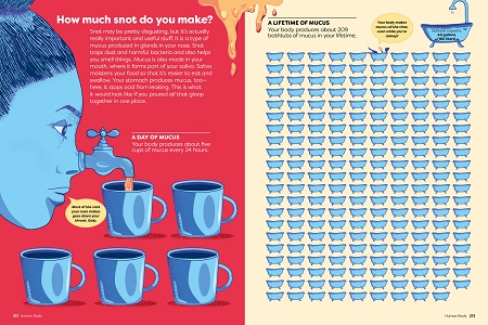
There are so many! I particularly like the map of the world showing how many aeroplanes are flying up in the sky at any one time; a scale illustration of our Sun alongside UY Scuti, the universe’s largest known star; and Valentina’s wonderful illustration of how many bathtubs of snot the human body produces in a lifetime (209!).
 |
Valentina said she hoped this project would “raise the bar of data literacy.” What do you mean by data literacy?
Being data literate means being able to read and understand information when it is presented in the form of numbers and statistics, and also being familiar with related concepts such as proportion, probability and scale. Thanks to computers and the internet, our ability to measure and analyze data is growing exponentially. So, developing an understanding of what all this data is telling us about the world has never been more important, especially for children.
Could a teacher design a course using this encyclopedia as the textbook? What age group would you suggest?
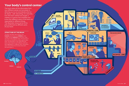
The Encyclopedia Infographica will certainly help young readers understand and get excited about lots of topics that they will be studying at school. The chapter on the body, for example, is a brilliantly fun and accessible introduction to human biology. As for an age group, anyone between the ages of 8 and 108 will enjoy this book.
 |
What’s been your favorite reaction from a young reader to this encyclopedia?
I enjoyed this review posted online by a 12-year-old reader: “I love how this book presents the most obscure answers to all of the questions I never thought of asking!” That’s exactly the reaction we were hoping for.
How do you envision the sequel to this encyclopedia?
The sequel?! After three years’ work on the Infographica, I think we’ve earned a break!
SPONSORED BY


Added To Cart
RELATED
BOOKS
PREMIUM
Tide’s Journey
BOOKS
PREMIUM
Whose Footprint Is That?
BOOKS
PREMIUM
The Tiniest Giant
BOOKS
PREMIUM
I Can Say Eat!


RECOMMENDED
CAREERS
The job outlook in 2030: Librarians will be in demand
CAREERS
The job outlook in 2030: Librarians will be in demand
ALREADY A SUBSCRIBER? LOG IN
We are currently offering this content for free. Sign up now to activate your personal profile, where you can save articles for future viewing
ALREADY A SUBSCRIBER? LOG IN
Thank you for visiting.
We’ve noticed you are using a private browser. To continue, please log in or create an account.

Add Comment :-
Be the first reader to comment.
Comment Policy:
Comment should not be empty !!!