


2018 School Spending Survey Report
My Library’s Summer Reading T-Shirt is Cuter Than Yours
Or is it? Folks, it is a truth universally acknowledged that a library in possession of a summer reading program must produce a t-shirt of some kind. And generally speaking, it is usually a walking eyesore. Though I owe New York Public Library more than I can ever repay, I must confess that each and […]
Or is it?
Folks, it is a truth universally acknowledged that a library in possession of a summer reading program must produce a t-shirt of some kind. And generally speaking, it is usually a walking eyesore. Though I owe New York Public Library more than I can ever repay, I must confess that each and every summer I would receive my designated summer reading t-shirt. It would be size XXXXXL (it’s much easier to give all staff employees a t-shirt if you just make it one-size-fits-all), usually white, and sporting a design that generally looked better on paper than on a living human body.
When I moved to Evanston, IL, I expected more of the same. What I got was this:
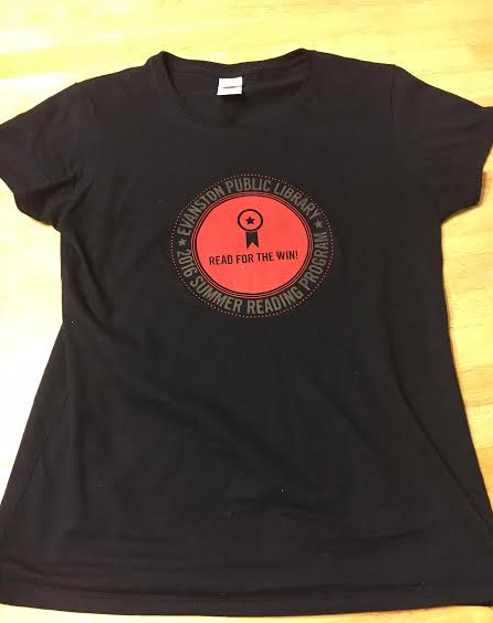
There were multiple sizes. It was black (I still retain a New Yorker’s love for that slimming, you-can’t-see-dirt-on-me color). The design was in red. It was, to be frank, the most beautiful summer reading t-shirt I’d ever seen.
Which got me to thinking. I just sort of took it for granted that, like a kind of penance to the library gods above, all summer reading shirts were supposed to be unattractive. But maybe I was wrong from the start.
So here’s my challenge to you: Send me a picture of your summer reading shirt if it is more attractive than this one. Then I’ll compile the results and create a Summer Reading T-Shirt Fashion Show. Not only will this be a way you can give props to the design team of your local library, but it could give some libraries ideas for their own attractive summer reading t-shirt designs in the future.
All t-shirt designs may be sent to fusenumber8 at gmail dot com. Looking forward to them!

Added To Cart
RELATED


RECOMMENDED
CAREERS
The job outlook in 2030: Librarians will be in demand
CAREERS
The job outlook in 2030: Librarians will be in demand
ALREADY A SUBSCRIBER? LOG IN
We are currently offering this content for free. Sign up now to activate your personal profile, where you can save articles for future viewing
ALREADY A SUBSCRIBER? LOG IN
Thank you for visiting.
We’ve noticed you are using a private browser. To continue, please log in or create an account.
Add Comment :-
Be the first reader to comment.
Comment Policy:
Comment should not be empty !!!